November 23, 2021 at 4:13 PM
Today in bad practice in the data visualization space: the Dutch government website showing a heat map of the # of people who tested positive to Covid-19.
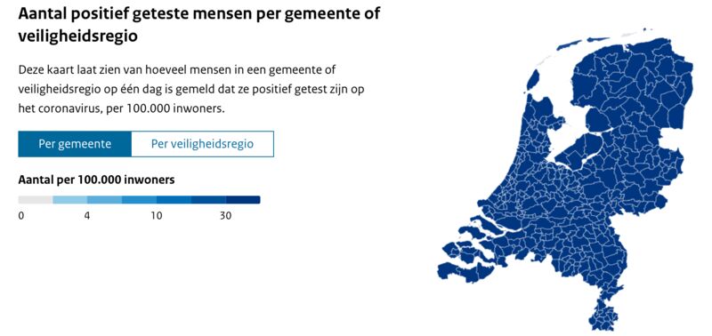
The idea behind the map is nice: which areas in the country are most affected.
But the heat map is useless: there’s a only a single color shown: dark blue!
👎🏼 #datavisualization #covid